Way back in 2017, shortly after moving to northern Virginia and starting this little business, I joined the mailing list for the Audubon Society of Northern Virginia (ASNV). As a bird lover, I thought it would be a great place to start learning about conservation organizations in the area, meet some local bird people and sharpen my bird ID skills. Not long after signing up for emails, ASNV sent out a notice that they were looking for someone to volunteer to help manage their website. Even though I didn’t know a whole lot about that at the time, I jumped at the opportunity. A couple of training sessions later, I was posting news articles and updates every month and working with a great little group of people on all things communications.
Fast forward a year and a half or so (and a ton of learning for me), ASNV hired me to do this job after realizing that it’s a lot more than can be expected from a volunteer position and that the site needed to evolve to support a growing membership. Over the next several years, I redesigned the website, revamped the monthly newsletter layout, took over newsletter production responsibilities, created a new format for ASNV’s annual appeal, and helped with myriad other communications efforts for the organization. It’s basically a dream job, and I continue to support them in the same capacity.
In summer 2024, after a lengthy decision-making process, ASNV changed its name to Northern Virginia Bird Alliance. I was honored to be asked to develop a new logo for the organization, which needed to represent a continuation of the great conservation work that has been done since its founding in 1984 while embracing a new evolution of its membership and values. To that end, I developed several concepts that kept the iconic Pileated Woodpecker central to the logo while exploring ways to modernize and update it. The final logo features the woodpecker in flight, suggesting motion and forward movement. Having worked so much with the old logo over the previous years, I also took the opportunity to make the new logo more flexible and bold so that it could be more easily adapted to the many different applications we would ultimately use it for.
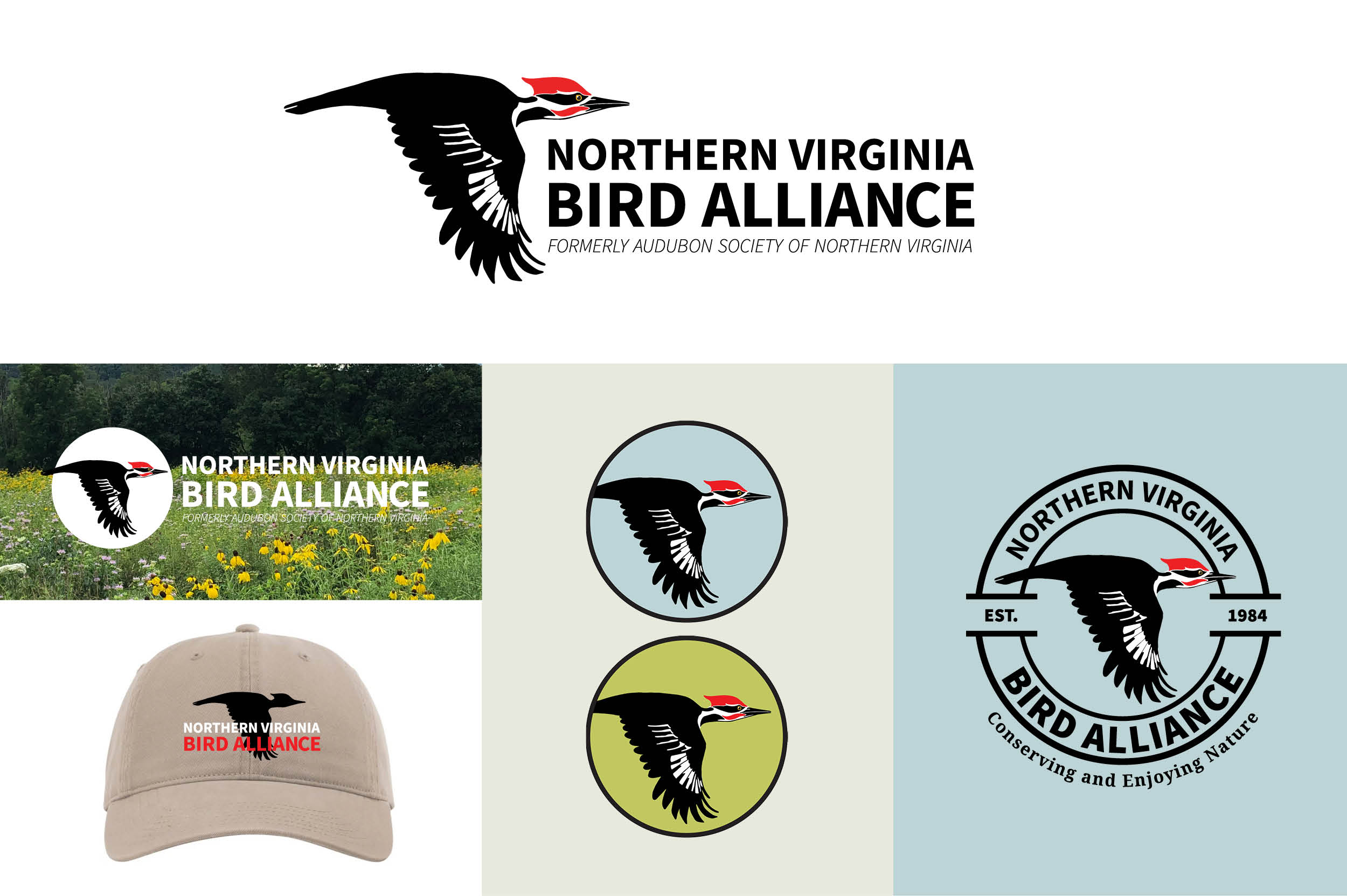
The final primary logo, top, and some examples of variations that I created for different purposes. For any brand, having a logo that is visually consistent across every application it touches is so important, and that means considering different color combinations, scales and processes…for instance, embroidery on a hat is very different from screen printing on canvas tote bags.
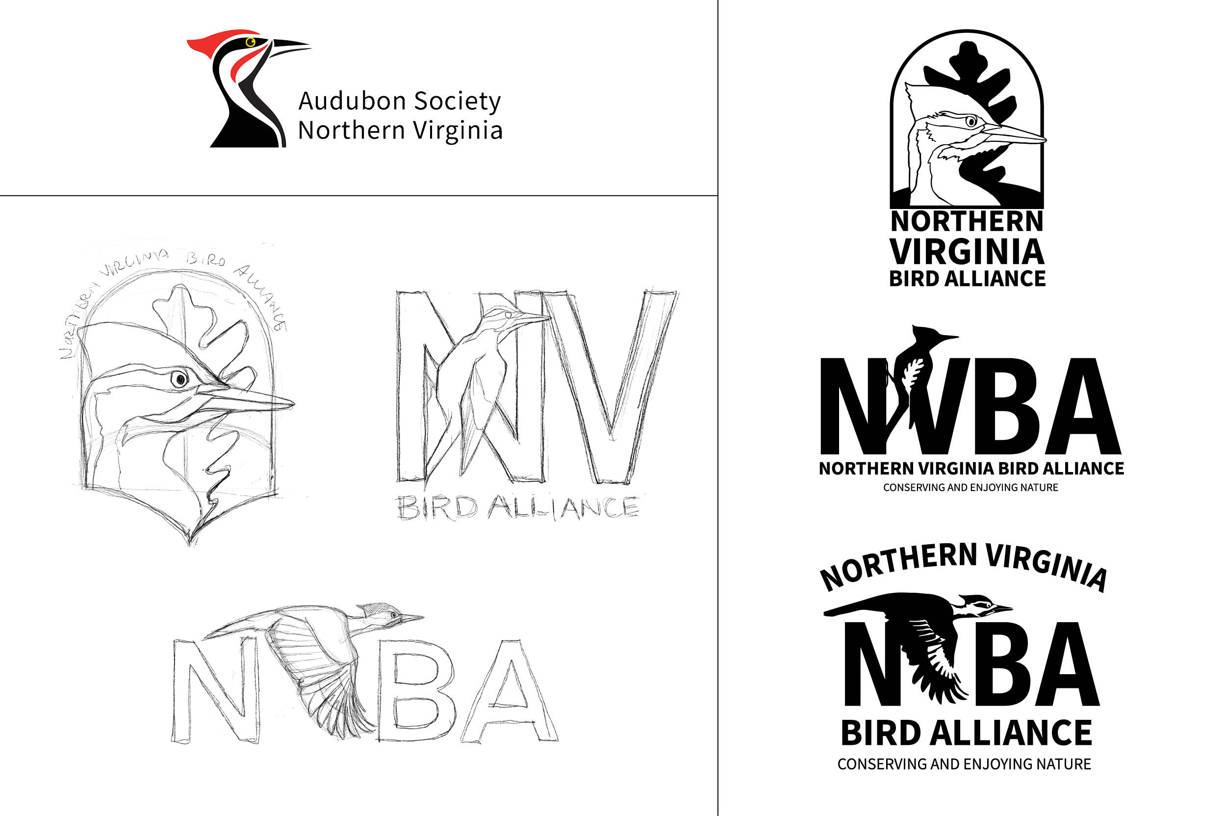
Top left: The original ASNV logo featuring the noble Pileated Woodpecker.
Bottom left: Initial rough concept sketches. I wanted to show the woodpecker in different ways and reference plants in some subtle way since habitat conservation and restoration is a big part of NVBA’s work.
Right: The first refinement of the initial sketches.
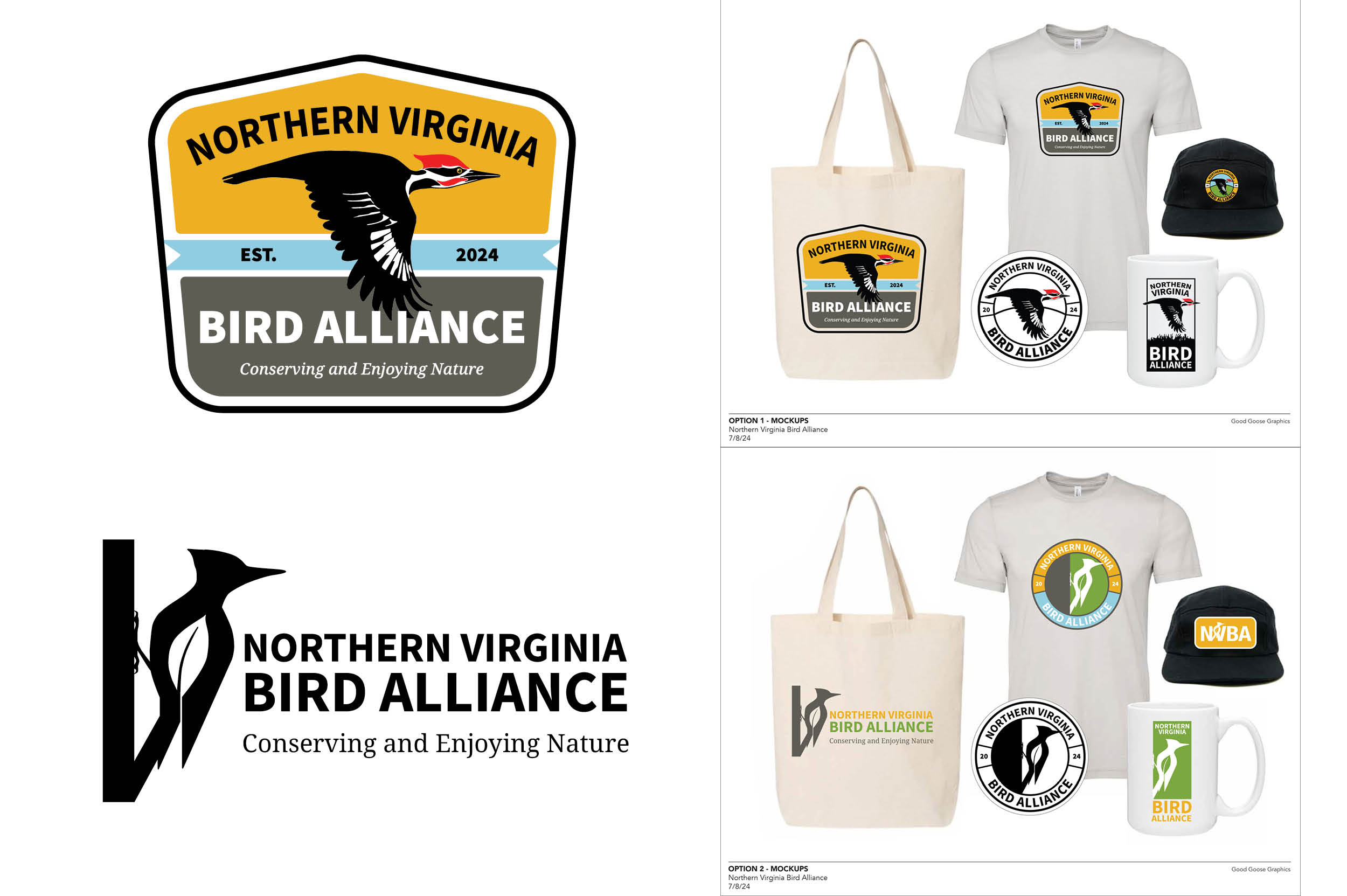
The second round of refinement for the top two logo concepts included mocking up some cool merchandise to see how the logo might translate onto different things.
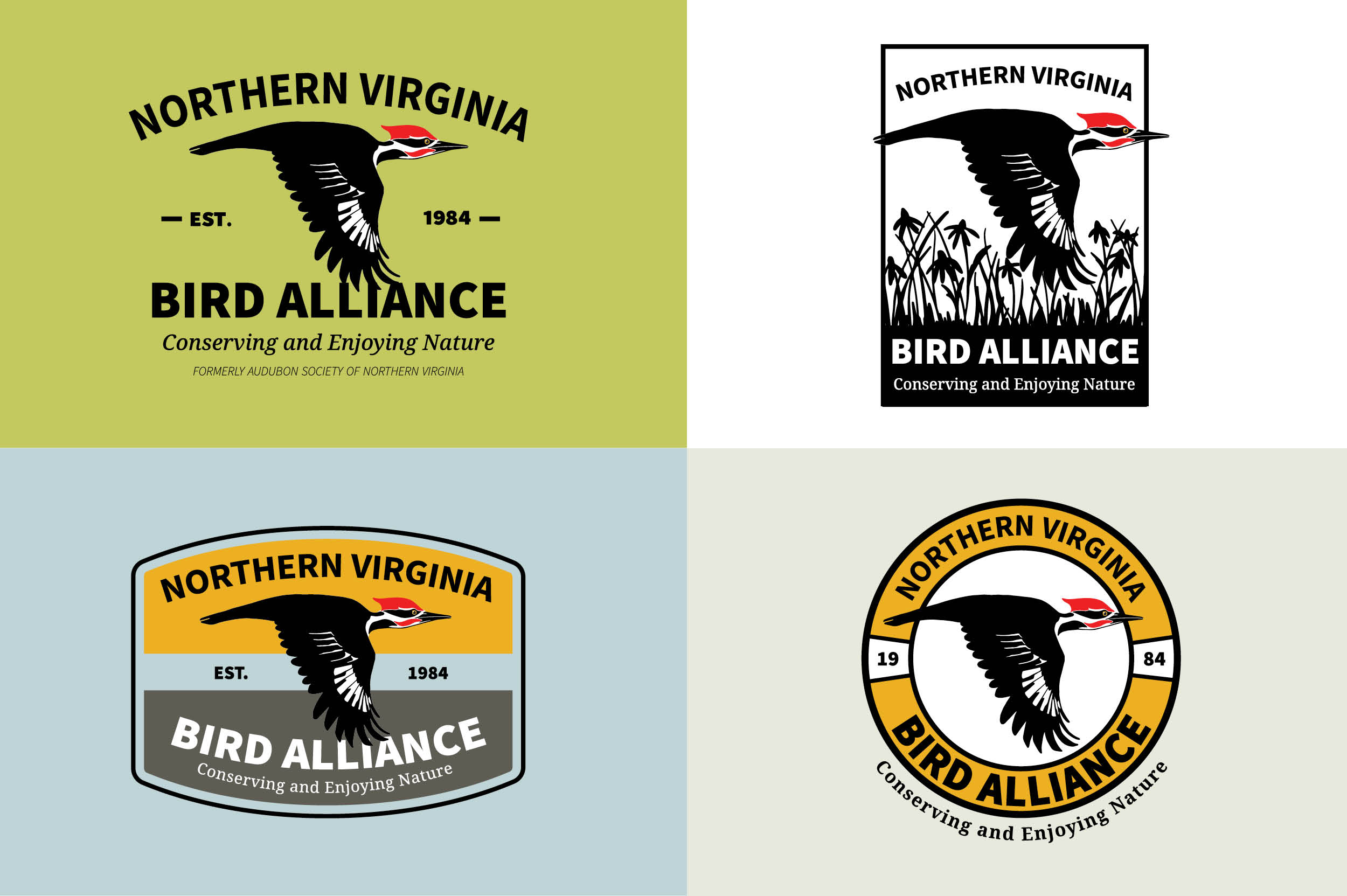
The third and final round of refinement for the top two concepts took into consideration comments from the board and resulted in choosing this configuration for the final logo. The decision came down to the bird, and the dynamic, forward-moving woodpecker in flight best fit the new direction of the organization.
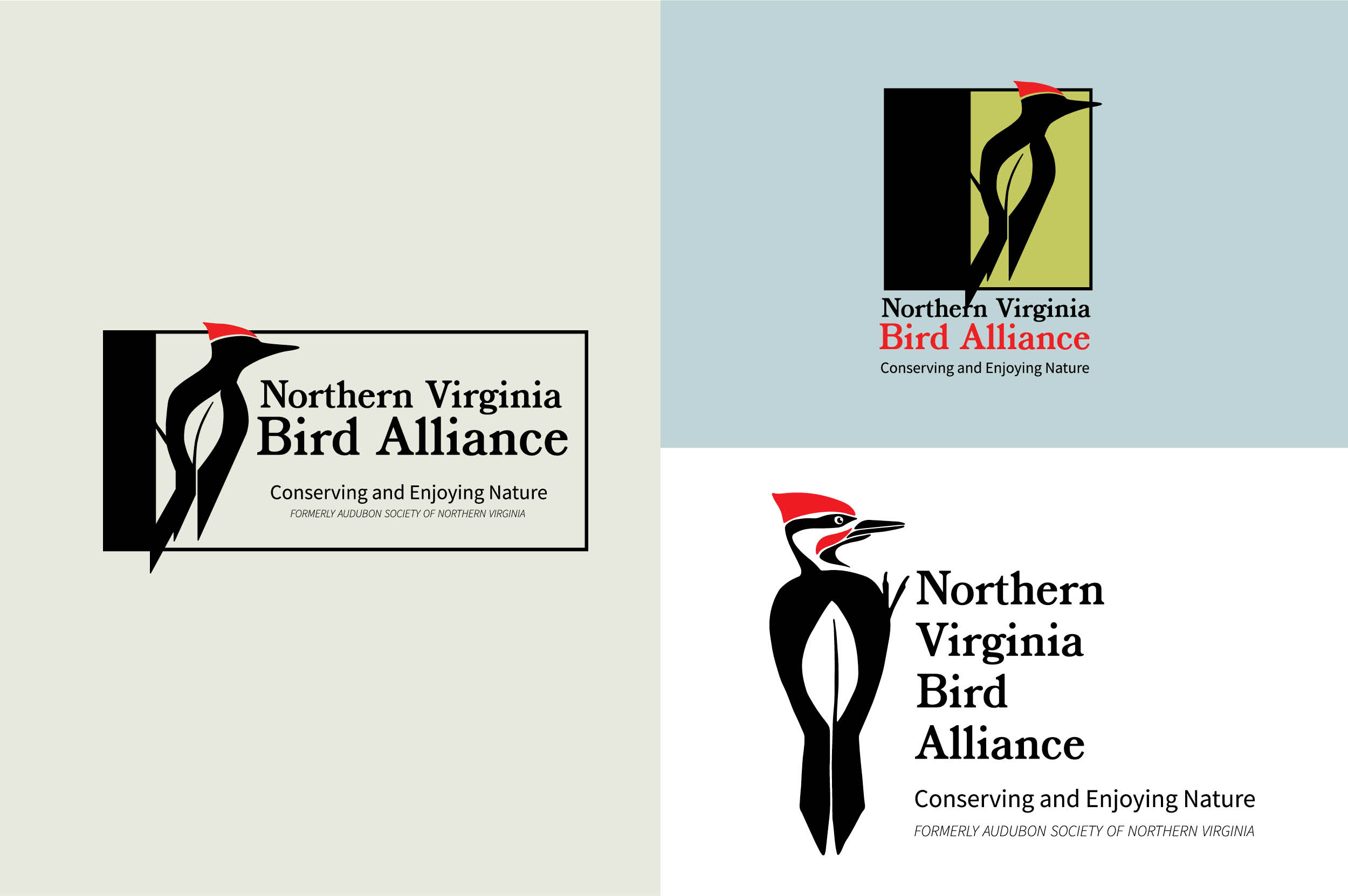
This unused logo took a more minimal approach to the bird, using negative space to depict the shape of a leaf within the body of the bird to suggest plants and habitat. The more realistic depiction of the woodpecker was ultimately preferred, but I still like the simplicity of this.
